2024-2025 Competition Playbook
This playbook is designed to help you look back on your journey through the 2024-2025 Wharton High School Data Science Competition. Here, we are highlighting the strategies student teams used, the challenges they tackled, and the expert approaches used to benchmark your work.
Below, you’ll find insights into how student teams cleaned and explored data, built predictive models, and communicated their findings. You’ll also see how the Wharton (data science) team of analysts approached the same problems, offering a “gold standard” for comparison and learning.
Use this playbook to reflect on what you tried, what you learned, and how you can keep growing as a data scientist. We hope this playbook serves not only as a record of your hard work but also as a learning resource for your next steps in data science and sports analytics — and that it inspires your next great project!
Preparing and Understanding Your Data
The first phase of the competition challenged student teams to dive deep into a large dataset—over 5,300 games—and extract meaningful insights to rank basketball teams and predict first-round matchups. This phase required analytical horsepower, teamwork, technical thinking, and a creative approach to messy real-world data.
Reflect & Learn: How Other Teams & Our Team Approached the Problem
The models built by the Wharton team followed these principles. Your approach may have differed, but reflecting on these strategies can help you improve and innovate in future competitions.
- Created relevant new variables like point differential and possession-adjusted stats
- Approach D2 teams with care—either dropping them or modeling them collectively
- Used thoughtful, case-specific strategies to handle missing data
- Leveraged statistical tools like regression, logistic models, and Elo ratings to rank teams and predict outcomes
Enhancing the Data: Feature Engineering
Some of the most effective submissions took raw game statistics and engineered new, performance-driven variables to gain a strategic edge. These included:
- Win/Loss Indicator – Outcome measure calculated from game outcomes
- Margin of Victory (Mov) or Point Differential –Alternative outcome measure: team_score – opponent_team_score
- Dean Oliver’s Four Factors – Inspired by a classic sports analytics framework: shooting efficiency, turnovers, rebounding, and free throw rates
- Strength of Schedule – how tough each team’s season was by examining their opponents’ records
- Possession-Based Adjustments – normalized team stats per possession to account for pace of play, as discussed in the education modules
A Common Challenge: Division 2 Teams in the Mix
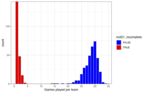
The season record contains 564 unique teams. Below is a histogram of the count of games per team over the season. 208 teams only appear in a few games. The complete game record for all D1 teams was provided. Sometimes a D1 team plays a D2 team; these games are included in the season record. The field `notD1_incomplete` was included to flag the teams without complete season records; the D2 teams.
Four D2 teams happened to win their one game against their D1 opponent. 27% of submissions mistakenly included a D2 team in their regional top 16 rankings – based on very limited data, undefeated 1–0 records.
What worked better?
- Many submissions dropped all D2 games, sacrificing 5.8% of the dataset. This was a safe, efficient choice—but not the most robust.
- Our approach grouped all D2 teams into a single aggregate “D2 team”. This “D2 team” underperformed significantly, with a collective winning percentage of just 1.6% and an average point differential of -39 points/game. This method preserved data and strengthened predictive power.
Missing Values: A Case for Careful Imputation
Most core variables were complete, but peripheral fields—like game attendance— often contained missing values. A common shortcut was to fill in all these missing values with zeros. In the case of attendance, this would imply zero spectators, which is unlikely.
Instead, stronger submissions used thoughtful data imputation strategies, such as replacing missing attendance values with the team’s season average at home games—a more reasonable and informative solution.
Creating a Model
One important takeaway from this competition is that in data science, there’s rarely a single “right” answer. While unsatisfying, it’s what makes data science powerful, creative, and open-ended.
This competition used real-world basketball data, with real teams and real stats. There is no way to know the ‘true’ quality of each team. In last year’s competition, we simulated soccer game outcomes from models we created. In that case, there was a ground truth, the input to our models, but simulated data is ‘wrong’ in different ways.
While there is no correct answer, that doesn’t mean all models are equal. There are better approaches and better predictions. Here, we’ll outline the Wharton team’s approach for developing good models.
Start Simple: Wins, Losses, and Point Differentials
The natural place to start was the win–loss record. And that’s a solid beginning—teams with more wins are generally stronger. But digging a little deeper provides more insight: the margin of victory or point differential can be calculated for each game. Switching the outcome variable from win-loss to margin of victory offers a richer view of what happened in the game.
A basic model that uses average point differential per game can serve as a solid benchmark for more complex methods. It’s simple, interpretable, and surprisingly effective.
Build Complexity: Opponents, Efficiency, and Context
Stronger models go further by adjusting for context and other potentially meaningful factors, because not all wins are equal. Stronger models began to account for who teams played, not just how often they won. A win over a top-10 team is different than one over a lower-tier opponent. This is where strength of schedule came in, with teams adjusting their models using opponents’ records or building Elo-style rating systems that dynamically responded to wins and losses.
Some submissions also broke down team performance by calculating:
- Points scored and allowed per possession – helping normalize stats for pace of play
- Offensive and defensive efficiency – separating scoring ability from overall game outcomes
- Contextual factors like home vs. away games, travel distance, and rest days
Incorporating these elements into regression models allowed submissions to estimate team strength while controlling for real-world variability. These features can be included as controls in a regression model, and together with our efficiency-based measures for points scored/allowed, we can engineer a regression model to estimate each team’s offensive and defensive strength.
Assessing Your Predictions: Run Multiple Models
In data science, no single model presents the whole picture. Each one makes assumptions, highlights certain patterns, and has its own blind spots. An ensemble model combines the predictions of multiple models. Instead of relying on one method, you bring together the strengths of several. One model might be great at picking up trends in point differential, while another does better with contextual variables like home court or rest days. By aggregating diverse predictions, ensembles reduce bias, variance, and overfitting. This approach often outperforms individual models, especially on complex tasks. For example, within the final five submissions in the competition, many employed multiple modeling approaches.
The Wharton team also took this same approach, using an ensemble model to benchmark performance. Interestingly, the team’s ensemble model matched very well with the ensemble of all submitted models.
Some submissions also broke down team performance by calculating:
- Points scored and allowed per possession – helping normalize stats for pace of play
- Offensive and defensive efficiency – separating scoring ability from overall game outcomes
- Contextual factors like home vs. away games, travel distance, and rest days
Incorporating these elements into regression models allowed submissions to estimate team strength while controlling for real-world variability. These features can be included as controls in a regression model, and together with our efficiency-based measures for points scored/allowed, we can engineer a regression model to estimate each team’s offensive and defensive strength.
What Models Did Teams Use in this Competition?
Here’s what stood out when we analyzed the 362 Phase 1 submissions (using a model of models):
-
- Elo models were widely used and effective – 5 of the 25 semi-finalists used some sort of elo model.
- Elo models that incorporated Margin of Victory (Mov) did especially well.
- Elo models were not as susceptible to the ‘undefeated’ D2 teams, because of how they score multiple games across a season.
- XGBoost performed fairly well for submissions.
- Elo models were widely used and effective – 5 of the 25 semi-finalists used some sort of elo model.
- Regression models were widely used, and submissions that included regression models did well.
- Some machine learning approaches largely did not perform well for submissions. These models are more challenging to interpret and can go wrong more easily.
- Random Forest models did poorly for most submissions.
- Some machine learning models can go wrong easily; some ranked ‘undefeated’ D2 teams.
- However, the 2nd place team also used machine learning approaches – understanding how to assess these models is key.
Team Spotlights
Selecting the semi-finalists and finalists from many thoughtful and rigorous submissions was no easy task. In Phase 1, the most successful teams built accurate models, and they told clear, convincing stories about how their models worked and why their decisions made sense within the limits of the submission form. Phases 2 and 3 team presentations blended statistical rigor with thoughtful design, communicating complex ideas in accessible ways. They blended rigorous statistical analysis with thoughtful narrative structure, walking the judges through their methodology step by step while grounding their insights in basketball logic.
WANT TO SEE THEIR WORK?
Explore the top teams’ presentations and learn more about their methods below.
Methods Submitted in Phase 1
Data Prep
We filtered out non-D1 games and removed rows with significant missing data. Key statistics were normalized on a per-possession basis. We imputed remaining missing numeric fields using regional medians. This cleaning process ensured data consistency and allowed for fair comparisons across teams with varying numbers of games played.
We created offensive and defensive efficiency metrics, rest advantage calculations, and a logarithmic travel fatigue factor to provide insights into team performance beyond raw statistics.
Software
Python served as our primary programming language. We used pandas for data cleaning and transformation, NumPy for numerical computations, scikit-learn for implementing our Elo rating system and logistic regression model, and Matplotlib for creating visualizations to analyze feature importance and model performance.
GenAI tools: We used ChatGPT for debugging code and automating repetitive text formatting tasks. All methodological decisions, data analysis, and final predictions were conducted solely by our team.
Statistical Methods
We implemented a modified Elo rating system, incorporating home court advantage (+70 points), a margin of victory multiplier, and rest day adjustments. Win probabilities were calculated using a logistic function based on Elo differences. We employed temporal cross-validation, training on January-February games and testing on March games. Feature importance was assessed using gradient boosted decision trees. Our final model combined the Elo ratings with logistic regression to account for contextual factors like rest days and travel distance. We used confusion matrices and ROC curves to evaluate prediction accuracy and model calibration.
We ranked teams within regions based on their final Elo scores, which were derived from the outcomes of over 5,300 games. These scores were further adjusted for strength of schedule by considering the average Elo rating of each team’s opponents throughout the season.
We determined winning probabilities by combining the Elo rating difference between teams with contextual features such as rest days and travel distance. The final probability was calculated using a logistic function, with adjustments for these additional factors, and then clamped between 0.15 and 0.85 to prevent overconfidence.
Model Evaluation
We evaluated model performance using temporal cross-validation, splitting training and testing sets chronologically (train: January – February; test: March games). Metrics included accuracy (65.2%), Brier score (0.207), and ROC AUC (0.712). We further validated our predictions through calibration curves, confirming probability alignment, and confusion matrices to assess classification precision and recall.
Methods Submitted in Phase 1
Data Prep
We utilised Google Sheets to conduct our cleaning and transformation. Firstly, we separated data for non-Division 1 teams from all of the CSVs. This allowed us to remove statistics that may cause bias. We substituted N/A values with 0 to make all fields numeric. We calculated the sums and averages for each team. We recreated the advanced statistics found on the NBA website using the formulas also provided on the website. We also created our own variable which was lead retention rate.
Software
Google Sheets was used for all of our data manipulation and visualisation. Python was used for data visualisation and was the language we used to build our machine learning algorithms. ChatGPT was used to write/debug code. TinyTask is software for macros, which we used to quickly finish repetitive manual tasks.
GenAI tools: We used ChatGPT to create models to make up for our lack of technical knowledge. We coded one model manually but decided it was more efficient to use AI tools.
Statistical Methods
We employed descriptive statistics to analyse team performance using means and other statistics. Using Python we created a scatter matrix alongside Spearman’s analysis to investigate the relationship and correlation between variables. With our findings, we used suitable functions – such as logarithmic and polynomial functions – to transform data and create linear correlations between variables. We recognised the situation posed to us a binary classification problem therefore we concluded as a team that we should adopt machine learning methods as our predictive modelling technique. After thorough research of different classification algorithms, we created multiple different machine learning models with the aid of ChatGPT, using the variables with the strongest correlation as features.
Using a similar approach to the playoff probabilities, we set up data for benchmark teams – a team with the statistics of the average of every team and teams with the statistics of the average in each region. We used the average of the probabilities of winning from the best algorithms to give teams a rank.
Using our various models, we trained the algorithms four times each using random sets of testing and training data, then output their predictions for the playoff games. We selected the eight best performing models to average the results for the final probabilities.
Model Evaluation
We used three metrics to measure model performance; accuracy, area under curve, and F-score. When we were selecting the best performing models, we predominantly used distance from the mean accuracy, AUC and F-score. The metrics were retrieved using in-built python functions. Our best performing model had metrics of 0.8047, 0.8787, 0.8457 respectively.